Southern Pacific Lines
Coast Line Division
“The Route of the Octopus”
Southern Pacific Lines
Coast Line Division
“The Route of the Octopus”

General Information
Signs
Font
It appears that Roman lettering for signs was phased out even before the major sign changes of 1956. For example, "Railroad Junction One Mile" signs originally had both Egyptian and Roman lettering but a 1951 revision of the plan called for only Egyptian lettering. "Yard Limit" signs originally had Roman letters but a 1947 revision of the plan called for Egyptian letters (yard limit signs of Roman lettering were still around in the early '50s, so it would be OK to have both types on model railroads depicting the late-forties to early-fifties period).
John Sweetser
For some pre-1956 CS drawings, look for an early MoW and Structures Rules & Regs book. Some contain reduced size versions of the CS drawings, some are fold out. A 1923 edition shows many of the ROW signs, including the milepost markers mounted on telegraph poles.
Chuck Catania
Southern Pacific Lines Common Standard Plans
One main drawback of the five volumes of "Southern Pacific Lines Common Standard Plans" is that most of the sign plans reflect post-1956 changes, so for one modeling the steam age, the volumes are of little use for signs. However, era-appropriate plans for whistle posts, fouling point signs, station signs, station one mile signs, etc. can be obtained for the Calif. State RR Museum Library. For speed boards, see the plan in Signor's and Thompson's "Southern Pacific Coast Line Pictorial."
John Sweetser
Specific Signs
Block Signs
BEGIN SAN SIMEON BLOCK (outside of SLO)
El Camino Block
SANTA MARGARITA-END CTC
BEGIN SANTA MARGARITA BLOCK
Block Signal Number Plates
Modeling Block Signal Number Plates
Lettering & Numbering
Decals
Microscale #87-1332
http://www.microscale.com/Merchant2/merchant.mvc?Screen=PROD&Product_Code=87-1332
Pat Flynn
Microscale #87-1376
Items on each decal sheet include a good number jumble for signal number plates, four "signal bridge", two each "Begin CTC", and "End CTC,", six "A" (absolute) and four "G" mast plate letters. Also included are a pair each of "V," "X," and "S." Six "Elevation" and numbers in red are provided.
Bill Decker
Bridge Signs
Name of River
On SP's steel bridges, the stream crossing was often identified. For example, pg. 121 of Strapac's "Southern Pacific Review 1952-82" has a photo of the SP bridge at Yuma which appears to have the faint words "Colorado River" painted on it. The word "Colorado" is above "River" and both words are slightly curved in opposite directions. An SP common standard plan showing this type of bridge sign can be found on page 37 of the July 1974 NMRA Bulletin. The plan well illustrates the lettering curvature but there is no lettering dimensions (the Yuma bridge had no crossing number like shown in the plan. Also, the plan does not show any milepost number below the stream name but it appears the SP usually included milepost data). The best close-up photo seen of this painting practice is on page 15 of the 1979 Kalmbach booklet, "The Diesel from D to L," which shows the end of the girder bridge over Tehachapi Creek at Caliente (reprinted articles in Trains magazine and the photo was in the May 1979 issue of Trains).
Naming the stream crossing on bridges seems to have been a fairly wide practice but it may not have been done in all cases.
On bridges that did not have structural members wide enough to paint such signs, a low wooden sign was placed in the ground instead. See the photo on page 133 of John Signor's Tehachapi book showing the sign identifying the second crossing of Tehachapi Creek and the photo on page 122 of Fred Matthew's "Northern California Railroads, The Silver Age" showing the sign identifying Castle Creek near Dunsmuir. These wooden signs were situated on the railroad west side of bridges and on the right side of the track as seen from a train traveling eastward, with the same information painted on both sides of the signs.These wooden signs were the same style as the signs painted on bridges.
Photos also show such wooden signs at the fourth crossing of Tehachapi Creek just below the Tehachapi Loop and at the third crossing of Caliente Creek at Caliente.
Impaired Side Clearance
Another type of sign commonly associated with SP steel bridges (especially bridges with truss members) were "Impaired Side Clearance" signs, which were on posts just before the bridges. Photos that show the "IMPAIRED SIDE CLEARANCE" sign near the Martinez-Benecia Bridge can be found on the cover and on page 91 of the Robert O. Hale photo book "Railroad Photography Western States." Page 10 of "Southern Pacific Lines Common Standard Plans Vol. II" has a plan that depicts an Impaired Side Clearance sign but be aware this is a 1962 revised plan which calls for a metal signboard instead of wood as was used earlier. The dimensions for the signboard may be the same as was used earlier but the post in the revised version was smaller, 4 inches vs. 5 1/4 to 5 1/2 inches.
Trespassing Sign on Bridges
Page 32 of “Southern Pacific Lines Common Standard Plans Vol. 1" has a 1958 revision of plan C.S. 1301, which shows a sign stating "Private Property All Persons Forbidden to Trespass Hereon" and a note that indicates the sign is "To be used at each end of long bridges, long trestles, tunnels, etc., or as directed."
There are earlier versions of this plan and can be found at the California State Railroad Museum Library and are listed on the library's website like this:
Southern Pacific CS 74 Oct. 11, 1905/Nov. 30, 1926.
Common standard: trespass and no thoroughfare signs. Filing location: Box 126 ID 24589
Southern Pacific CS 1301 [Former number: CS 74] Oct. 11, 1905/Mar. 21, 1933.
Common standard: trespass and private property signs. Filing location: Box 128 ID 25291
From the above, it appears that CS 74 was renumbered to CS 1301 on March 21, 1933.
The 1958 revision of CS 1301 has the wording "Private Property" on the top two lines of the sign and "All Persons Forbidden to Trespass Hereon" on the bottom two lines of the sign. However, the CS 74 plan of 1926 and the CS 1301 plan of 1933 may have called for the wording "Private Way For Trains" on the top two lines (with the same wording on the bottom two lines).
John Sweetser
For a post-1924 photo of a bridge sign that states "Private Way For Trains," see page 161 of Myrick's "Railroads of Arizona, Vol. I." Page 103 of Huxtable's "Daylight Reflections", 2002 version, has a color photo showing an identical type sign outside of Tunnel 26 near Chatsworth.
John Sweetser
Speed Signs
As for speed signs, in most cases they were probably in advance of the bridges. For the lift bridges at Martinez and Sacramento, the special instructions portions of 1950s Western Division Timetables would state the milepost locations where the speed limits over the bridges commenced (specifically, look under the Martinez Subdivision section). For plans of the type of speed signs used in the 1950s, see page 270 of Signor & Thompson's "Southern Pacific's Coast Line Pictorial" which depict signs with dual speed limits (freight and passenger). For bridges that had just one speed limit, the number would be centered in the oval signboard.
DRAW BRIDGE ONE MILE Signs
Then there were "DRAW BRIDGE ONE MILE" signs. According to common standard plan 1375, such signs "shall be used in advance of all drawbridges even though the movement over the drawbridge is governed by interlocking signals." The plan also included a variation, "DRAW BRIDGE 1000 FT" signs, which were used "in lieu of or in conjunction" with Draw Bridge One Mile signs only with "the written authority of Division Superintendent." Signboards in both cases were oval and used SP Egyptian lettering.
Plan 1375 (titled "Fixed Signals - Distant Warning and Stop Signs") was a 1951 revision of common standard plan 15, which in turn was adopted in October 1904. Common standard plan 15 shows a "DRAW BRIDGE 1000 FT" sign but with SP Roman lettering for the 1000 FT instead of the all-Egyptian lettering of plan 1375. Some signs with the earlier-style lettering probably survived well into the '50s. Common standard plan 1375 has been reprinted on page 23 of SP Trainline #22 while common standard plan 15 has been reprinted on page 17 of the September 1979 NMRA Bulletin.
SP Crossbucks Cast Iron Posts
The cast iron, raised letter crossbucks, would be for the 1920 period.
Paint
The raised border was painted black like the letters. The skill or motivation of the MoW crew played a part as to whether the edges were painted in the field.
Pete McFall
SP Crossbucks Wood Posts
Lettering & Numbering
SP Crossbucks posts had the lettering "Southern Pacific"from below the crossbuck vertically down the post. They were pretty common. There is such a post in Bakersfield and Exeter, CA.
http://i158.photobucket.com/albums/t116/railsnw/signal-01.jpg
http://www.geocities.com/jim_lancaster.geo/spphotos/spcrossbuck.jpg
Note that SOUTHERN PACIFIC is in a sort of "ghost" lettering.
http://www.geocities.com/jim_lancaster.geo/sp_photos/sjvrr_crossbuck.jpg
Jim Lancaster
In Armona, California, cross bucks looked like the photo in Exeter except instead of it reading Southern Pacific on the vertical post it read: WATCH FOR THE CARS
"LOOK OUT FOR THE CARS” was the standard phrasing at one time on some SP crossbucks posts.
Modeling SP Crossbucks Wood Posts
Lettering & Numbering
Decals
Microscale #87-1376
There are two pair (total of four) vertical "Southern Pacific" sets for crossbuck posts per sheet (total of 8 per set). You'll have to find a different source for the "Railroad Crossing" lettering.
Bill Decker
DTC Block Signs
Modeling DTC Block Signs
Lettering & Numbering
Decals
Microscale #87-1401
This decal does have some mistakes.
Pat Flynn
Derail Sign
A Derail switch stand where supposed to have a Derail Sign. The SP adopted these types of signs in 1908 and they originally were supposed to be used at locations where there were no high switchstands indicating a derail. However, in California, the Derailing Switch Law, Act 6482 stipulated that such signs be used at all derail locations regardless if there was a high derail switchstand or not.
They were just like a regular high switch stands except they had a little metal plate below the target that read "DERAIL".
Prior to 1956wood post 4” square, 4’ high
Post 1956metal post
Dimensions of the sign plate and the lettering would remain the same.
Placement
Derail stands are placed on the same side of the track as the desired derailing direction. The Derail sign was attached to the stand or on a post within 4 ft of switch stand.
Paint
Derail targets during SP times were painted red. Front of the post is painted white
Today the signs are purple in color with a white "D".
Lettering & Numbering
The metal plate below the target read "DERAIL". or "Derail Switch" on them. Later the word "Switch" had mostly been eliminated on derail switchstand targets.
John Sweetser
Repro of a 1908 SP derail sign plan. Nov. 1972 NMRA Bulletin, pg. 37
1956 revision Southern Pacific Lines Common Standard Plans, Vol. 1, pg. 28
References
See Page 55 of Signor's Beaumont Hill book has a 1924 photo taken at Calipatria in the Imperial Valley that shows two wooden derail signs next to two derails.
The best photo showing a wooden derail sign, can be found on pg. 197 of Austin & Dill's "The Southern Pacific in Oregon."
John Sweetser
In the photos section, there’s two pictures of derails which protect the SP mainline at the Granite Rock Quarry at Logan taken in 2001. http://finance.ph.groups.yahoo.com/group/Espee/photos/browse/9684?m=l
"Attend to Derailing Switch" Sign
The "Attend to Derailing Switch" sign was made of cast iron.
Paint
The raised outline was painted black.
“Men at Work” Blue Sign
Blue signs are used at railroad facilities and placed on a track or equipment by persons working on said equipment. Movement cannot be made by locomotives or cars until the blue flag or blue sign are removed by the person who placed them there.
Rob Sarberenyi
The some lettering on the sign says STOP at the top. "MEN AT WORK" would be the most common industry standard
The SP blue signs are 12 x 13 inches, metal, and is white lettering "MEN AT WORK", and not a "blue flag." The metal ones are attached to hooks or staffs so that they can be put onto brackets or stood up in the track. Without those things, they could not be used in the normal way. Mine has a staff and a hook on one end.
Tony Thompson
The “blue flag” were bolted to a bracket that either was designed to clamp on to the track, hang on the end of a car or hang on the locomotive in plain view of the engineer.
Paul C. Koehler
Mile Post Signs
Southern Pacific marked mileposts along its routes, ordinarily by a number sign, giving the miles distant from San Francisco. This sign was mounted on the telegraph pole nearest to the milepoint, if that was convenient; otherwise a separate wood post would be used. A two-sided sign was the normal arrangement. The steel sign, which is porcelain enamel white with black Egyptian numbers on the outside, standard for SP signage. A drawing for those characters is included in S.P. Lines Common Standard Plans, Vol. 2. The 1979 revision date drawing does not mention sheet-steel signs, but signs of that type, with impressed numerals, were once common on the SP. The signs were mounted 10 feet above the railhead, and the mounting post was painted white to that height.
Tony Thompson
Early Version
Its numerals are 6 inches high, the sign 8 inches high.
Late Version
Its numerals are 9 inches high, the sign 12 inches high.
Paint
White sign with black numbers.
The mounting post (or telegraph pole) was painted white to that height of 10 feet.
San Luis Obispo Mile Post Sign
The SP milepost sign for San Luis Obispo was mile 252. The telegraph pole which the 252 sign was mounted was adjoining the Signal Dept. building across from the San Luis depot. In an Alden Armstrong photo of that building in the early 1950s; the white-painted milepost pole can be seen toward the left edge of the image, and the mile sign itself is just visible at the top of the white portion.
Reference
Drawing
There is a standard drawing for these signs, printed in of the Southern Pacific Lines Common Standard Plans, Vol. 2 (Steam Age Equipment Company, Dunsmuir, CA, 1993).
Modeling Mile Post Signs
Milepost signs are distinctive trackside features of an SP main line, and any representation of an SP main should include milepost signs. For a 12-inch sign height, this amounts to almost one-eighth of an inch when reduced to HO scale. Just reduced the digital Egyptian numerals of the sign to that size and printed it on paper.
Tony Thompson
Speed Signs
Among the many items of Common Standard signage on the Southern Pacific were speed signs, as the railroad called them. These were simply speed limits. The same information was included in employee timetables in the form of Special Instructions, but the signs were reminders at trackside.
The oval sign with two numbers has the higher speed for trains with all passenger equipment, the lower speed for all other trains. The Type B sign applies only to streamlined equipment.
Tony Thompson
1952-era drawing
1972-era drawing
The 1972 version does not include the “streamlined equipment” sign (round Type B) which is appropriate for 1953.
References
A 1952-era drawing: Trainline, issue 23 1989) SPH&TS magazine, from the Fred Hill collection
1972-era drawing: Southern Pacific Lines Common Standard Plans, Vol. 2
(Steam Age Equipment Company, Dunsmuir, CA, 1993).
Modeling Speed Signs
Simply reduce the image to HO size from one of the above drawings. Use the appropriate subdivision instructions timetable from a year you are modeling to choose the speeds on the sign. You can change the numerals to suit conditions, either from the drawing or from the Egyptian lettering drawing in Volume 2 (citation above). [Digital versions of Egyptian are available on the internet.]
Tony Thompson
Paint
The round Type B sign is to be yellow, the oval sign white. Apply the yellow color with a felt-tip highlighter pen.
Station Boards Signs
Depots have "station boards", the white boards that display the stations name, (i.e., Surf, Oceano, Eureka, etc.). SP did call their sign font "Egyptian," The signs were variable length to accommodate different length names.
Tony Thompson
Reference
Info about station signs are not in the Bruce Petty books.
Drawings
The actual drawing for station signs is C.S. 1318. A copy is posted in the Espee Yahoo Group under station sign or signs.
Ernie Fisch
Modeling Station Board Signs
Lettering & Modeling
Decals
Microscale
Actual sign LETTERING, can be found in Microscale set 87-1376 (HO scale) -- SP station signs, milepost numbers,
P-plates, etc. #87-1401 has station signs, DTC block signs, absolutes, G/P-plates, etc.
Tim O'Connor
Microscale should have taken just a bit more time with the set. Leaping off the decal sheet are two place names: "Allbany" and "Sacremento."
Bill Decker
Dry Transfers
Signs made with dry transfers have variable success.
Railfonts
You can used the Railfonts type for a depot sign. I've checked it against the SP lettering drawings at CSRM.
Tony Thompson www.RailFonts.com
Reference
See the article on an SP depot in Model Railroad Hobbyist in November 2012.
View at: http://model-railroad-hobbyist.com/magazine/mrh-2012-11-nov
Tony Thompson
Tunnel Numbers Signs
Some tunnel signs were attached to the right side of the tunnel itself. Other tunnel signs were attached to telltales. Tunnel numbers on wooden signs were specified in common standard plan C.S. 9, adopted October 1904. At that time, the signs measured 10" high and 16" wide. By 1921, this plan had been changed so that the length of the tunnel was included, with new sign dimensions of 15" high and 16" wide. Another change called for the signs being made of enameled metal.
John Sweetser
An interesting aspect of the Tehachapi tunnels is that portals for tunnels 3 and 5 had raised numbers (not painted) in the vicinity of the upper right of the portal openings at locations tangent to to the vertical wall of the portals and tangent to the top of the arch of the portals. The raised numbers were around 8 inches high. It’s presumed that other Tehachapi tunnels had similar raised numbers at the time.
Tunnel number signs were removed, a case of them being appropriated over time by thieving railfans.
John Sweetser
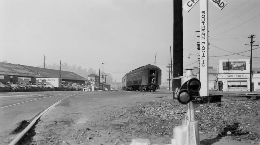
Whistle Sign
A sign with a W to indicate the engineer that should use the whistle. Southern Pacific utilized the X & W. When there were two or more road crossings separated by a quarter mile or less the company could get by with using a single X sign for all. This was done by placing a numbered sign on the whistle post just beneath the X. Thus an X with the number 3 displayed beneath it would indicate that the train was approaching three road crossings, with only a single X sign for all three crossings.
Page 360 of Beebe's "The Central Pacific and the Southern Pacific Railroads" has a photo taken at Landers, Calif. in September 1892 that shows an SP whistle post with both an X and a W on it. This may have been the standard at the time. Note that the post is fairly sharp-pointed (another sharp-pointed post can be seen in a photo on pg. 605 of the book). The sharp-pointed posts began to be phased out with the adoption in 1904 of joint SP/UP common standards for signs, which called for less-sharp points and just Xs on the signs. It remains possible that the SP adopted the less-sharp design on its own before 1904).
Some of the sharp-pointed whistle posts lasted a long time, as evidenced by the 1947 photo of the West Coast near Newhall found in the 1985 Whistle Stop Publications SP steam calendar.
Mention of these signs is in TT Bulletin No. 102, dated July 2, 1954, for Portland Division TT no. 146.
RULE 14. Following paragraph added to rule 14:
"Signs bearing the letter `X' located 1/4 mile in advance of certain public crossings at grade and signs bearing the letter `W' located one-forth mile in advance of certain tunnels and obscure curves, require engine whistle signal as prescribed by
RULE 14(1). Absence of these signs in advance of public crossings at grade, tunnels or obscure curves, does not relieve engineers from complying with Rule 14(1)".
In the Tehachapis up to sometime in the 1950s, there were metal whistle posts with Ws on them placed one-quarter mile from tunnels. The only photo of these signs is a print from Stan Kistler that was taken at the east end of Walong (the whistle post was for Tunnel 10). Other photos of the signs in the Tehachapi it only show the backs.
Examples: page 105 of "Santa Fe 1940-1971 In Color, Volume 3: Albuquerque - Los Angeles" and page 142 of Signor's "Tehachapi" (in the latter photo, look just below the front of the car that is right behind the helper). The signs had plates maybe three feet long mounted on a metal tube (in the era, there were similar metal signs for grade crossings that had Xs on them, but the plates were much shorter. See foreground of the bottom photo on pg. 217 of "Tehachapi").
Yard Limit Signs
1904 Rule book for MoW and Structures (C.S. 16)
- Mounting post 5 3/4 x 5 3/4, 10'6" high. 3'6" in the ground
- YL sign boards were 2'9" x 9" x 1 1/2"
- Posts to be set on Engineer's side 11'0" from center of track.
Chuck Catania
This drawing has the dimensions for the Yard Limit sign made from wood.
Keep in mind that standard milled lumber sizes were different back then.
1932 revision of C.S. 1382
The Calif. State RR Museum Library has a 1932 revision of C.S. 1382 in its collection but I doubt that it specified Egyptian lettering like the 1947 revision did.
John Sweetser
1947 revision of the yard limit sign plan, redesigned (C.S. 1382)
Posts were to be 5 1/2" x 5 1/2", 10' 8" high.
Sign boards were to be 1 3/8" thick.
Posts were to be set 13' from the center line of track.
John Sweetser
Lettering & Numbering
The most notable 1947 revision was replacement of Roman lettering on the sign with Egyptian lettering. In the '50s, though, both Roman-lettered yard limit signs and Egyptian-lettered yard limit signs could be found along the SP, as photos attest.
John Sweetser
1963 revision
The post is to be 3 1/2" x 5 1/2" x 12'.
Top of the post is to measure 9' 0" from the ground, to which is attached is a large Y. The post is to be mounted 13' 0" from the centerline of the track on the engineer's side, and to be outside of ditch in cuts.
Rob Sarberenyi
Lettering & Numbering
A large yellow "Y", coated on both sides with yellow Scotchlite reflective sheeting, is mounted to the post using 4 3/8" x 4 1/2" carriage bolts with washer under nut.
Reference
SP Yard Limit signs -- CS 1382 dated Oct. 1904, Revised July 16, 1963 -- appear on page 31 in Bruce Petty's book "Southern Pacific Lines Common Standard Plans, Volume 1".
1904 Rule book for MoW and Structures, Plate 58 (C.S. 16)
1947 revision of the yard limit sign plan, redesigned (C.S. 1382)
A copy of Southern Pacific's Feb. 19, 1947 C.S. 1382 plan for yard limit signs can be found on page 36 of the March 1949 issue of Model Railroader. Photocopies can be obtained by contacting the Calif. State RR Museum Library or the Readers' Sevices Dept. of Kalmbach Publishing.
1963 revision
Modeling Southern Pacific Right of Way Signs
Lettering & Numbering
Decals
Microscale #87-1332
http://www.microscale.com/Merchant2/merchant.mvc?Screen=PROD&Product_Code=87-1332
Pat Flynn
Microscale #87-1376
Items on each decal sheet include a good number jumble for signal number plates, four "signal bridge", two each "Begin CTC", and "End CTC,", six "A" (absolute) and four "G" mast plate letters. Also included are a pair each of "V," "X," and "S." Six "Elevation" and numbers in red are provided.
Bill Decker


